


...would you please add a slight tint to the links in a post? I just included a link to wikipedia, and I could barely distinguish it from the text around it when it was posted.
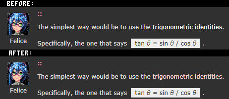
Here's a quick before/after to illustrate the issue and my suggestion:
 |
Not a big deal, but it'd be a nice quality-of-life tweak in return for what I assume/hope is one css edit.

Yes, great point Felice - I cannot SECOND this enough.
I keep forgetting how much of a pain it is that links don't JUMP out (although, I guess kinda helpful until the anti-spam measures are in place!)

If we're gonna get a change, I'd vote for a colorblind-safe color. I actually thought you had made a mistake and removed the link altogether in the second example. Unfortunately I can't distinguish the tinted link from the regular text. I had to look at my screen sideways to get the color shift to be large enough to see the difference between that and the regular text.

yes!
even worse, I only get your first example on mouse-over. otherwise it just looks like normal text in your post.
 |
I've been underlining my links for a while...
Fair enough, I was just following the site's gray/white/pink theme, but maybe tint it azure or something.
Given that there are several types of colorblindness, is there one color that consistently jumps out for all types?
Or maybe skip the tinting and go with boldface.
Or, or, just being crazy here, maybe have the links underlined? ;)

How about little icons on the right of each link, like Wikipedia?
I'll figure out some nicer monochrome on-site vs. off-site icons later, but here's Jelpi for now.
Yes, adding an icon indicating the on/off-site nature of the link is a good bonus idea.
I'm always a proponent of standardization, so I'd vote for using whatever icons Wikipedia uses. Jelpi is cute, but not super intuitive.
Maybe the shift-P glyph (PICO-8 logo) for internal sites and shift-G (globe) for external sites?
Hrm.. I tried some icon variations, but they are quite distracting in context. Back to simple underlines, but off-site link indication is todo'ed
I just noticed this while writing up my spammer list...
When you have a bulleted list, links in the list don't get formatted the new way. Example:
PS:
I'm sorry I'm always posting about things that need to be done or fixed. I'm sure seeing yet another post from Felice with "@zep" in the title gets on your nerves.
If it helps to offset that at all, I want you to know I love PICO-8, and I really appreciate what you've put into the world by writing it. You've given me moments of pleasure I'd not otherwise have had.
Most of my experience with PICO-8 is just sitting here toying happily with ideas. I probably look like I'm just bogged down in minor bugs all the time, but not really. It's a great, fun platform.
Hope that makes up a little for the friction all my bug reports and requests probably produce.
[Please log in to post a comment]