How to waste 268 tokens:

Time to bring back my old Lexaloffle intro animation for making PICO-8 carts. Still a bit heavy; 985 tokens and a row of sprites -- but perhaps I can crunch it down more later if needed!

i <3 this thread so much
this is painfully, criminally inefficient; i'm pretty noob :|

Great work from everybody, really like the thread idea.
Here's my modest contribution, it's very simple and not really optimized but it was fun to do.
You can press 'z' to reload the animation.

Eh, what the heck. Figured I'd give this a go, using my existing personal studio logo.
I'm still a PICO-8 amateur so I can't pull off any of the flashy effects you guys are using, but I prefer it like this anyway. It's nice and small, too, only 92 tokens. Now I just have to make an actual game to put it in front of.

Nice and simple. One sprite slot, 86 tokens. Should be easy enough to plop in front of anything I want.
--EDIT--
Here's an updated version of it. Now 97 tokens, with comments. Still only a sprite slot, no sound. You can now skip it by pressing the A/O/Circle button.

Those are some brilliant intros! As a complete beginner (my background is sound and graphics design) I'm currently struggling with sprite handling and this thread alone shed a lot of light upon it. Thank you all and consider making a full demo or "intro". :)

read about that flip function :) can someone explain what a back buffer is? o_o'


I cheated a bit and went ahead and created a splash screen for my own use, instead of a fake logo. Anything I should add or change?
The raven is made up of 2 sprites and is animated using palette switching.
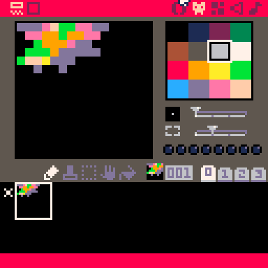
I'd also REALLY appreciate any advice on how to create a cawing sound.

Finally, a cart simple enough for me to finish it. Also my first attempt at palette swap animation. Kinda heavy with one 16x16 sprite and 257 tokens, but it'll do for now.
Still need to figure out how to get a nice "blub blub" sound.

- puts own name under logo
- uses palette swapping for splash screen
- needs to figure out how to make a natural sound in 8bit
Are we twins?

Either that, or my mind control experiment had some weird side effects.
Edit: Updated version
Added sound, simplified animation, cleaner logo, only 157 tokens..

btw your avatar is broken, because when you upload a new one it doesn't clear the previous URL from the field, it just concatenates them like "url_1url_2"

Whilst in the middle of making my latest game I decided that I needed a Logo and Splash Screen to go along with it, and I happened to stumble across this Thread while researching! It's quite basic but it does the job fairly well, thank you all for the inspiration!(The Audio sounds better in Pico-8 rather than the Online player, should be a nice quack!)

Hi, here's my contribution, I think I'll stick with it for a while.

Purchased Pico-8 yesterday and when I saw this thread I knew right away that I wanted to try my hand at this first.

Thread necromancy!
Not as cool as most people's here, but I thought it was a neat idea to have a splash logo. The logo is from my work on that other game.
My main problem is that I suck at making music and sound effects :(




Halp, I've started making a coroutine based animation library to make company logos.
Someone stop me.

This seemed like a fun first cartridge to make. Here is my contribution.
Maybe a little to long for a splash screen though.

I'm probably late to the party but anyways, here's mine:
i actually plan on using this one on my carts, and the text on the bottom will be random each time you run the cart (at least thats the plan)
got it to work with great help from Sean on the discord :D
now every time the cart is loaded it will show a different flavor text on the bottom of the screen :)
(you can ctrl+R to reload the cart and see the effect)

Yay! Time to revive a long dead post because I finally made a logo!


Been years I haven't posted in this thread. I still like this tiny logo idea a lot.
I did one inspired from my virtual sunglasses. Not that fancy, but gets the idea.
(Tempted to use it for future carts though, under another name)


Figured I'd add to this thread with a playing card idea.

Here's my (very simple) version. Its probably not very optimized bc im new to this but i think it looks good.
[Please log in to post a comment]


