


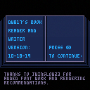
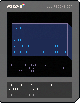
Here is the latest, 10-18-19
To load this in Pico-8, in the console immediate mode type:
load #brw-3 |
. . .
(older version)
Hope you don't mind me starting a new thread. I literally had to rewrite more than half the code here so I think it's deserving of it.
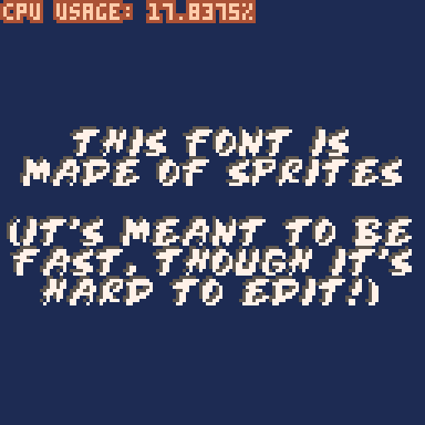
And yes, it now has a proportionally spaced font.
New configuration in code lets you turn on/off shadow (runs a lot faster without).
Configure page and ink color too. And of course this will work with any text file, provided you have enough memory for it. Anything close to 19,000 chars will fit.
You have a few questions ? I have a few questions. :D
Would you like me to post an additional version that uses soft-sprites instead of individual pixel-plotting as it is now ?
The advantage will be the bookreader will run much faster even with shadowing, the disadvantage of course is you can't inject your own sprites over the set during reading.
Also I could make a version that just reads the text file by itself without poking it to sprite territory.
Further I have the font-writer with the sprite table of fonts I doodled. Do you like the proportionally spaced font or would you like to build one of your own for it ? You will need that tool.
Let me know, and thanks everyone who's helped me get as far in Pico-8 as I have today !

This is really impressive! Also, I think there is no harm in posting the other versions/tools. ^^
Thanks, @flowinglily, I think the shade makes it more legible. Still, the font could probably be touched up by others and look better. I'll try to make the next release more utility than demo. So others can easily make use of it in their works.
I've got another project I want to finish first, almost done with it. Then will return to post that.
Lemme post the tool to work on the font anyways. So by the time I get back to this everyone will have an awesome font. :D
Usage. in Pico-8, type:
load #dnmf-0 |
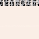
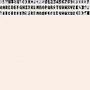
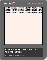
Doodle up your font in the sprites, 2-per 8x8 sprite field. Keep all characters left-justified and no more than 3-pixels across by maximum 6-pixels down per character. 5-down is normal uppercase letters. Black pixels are solely read. The white and light gray are a guide only.
Run. Your font is saved to clipboard.
You are encouraged to run more than one copy of Pico-8 as you work. For instance I have 6 carts open right now to help me with my coding. The clipboard works well across carts and it's tedious to close and open multiple carts in the same single Pico-8 console. So don't. :D
In the book reader cart, erase the "font=" line and press CTRL+V to insert this new one. Done. Run.
If you come up with a neato micro font (think thin !), please post and share it for everyone to enjoy.
You can do so by clicking the first sprite with your mouse, the one that shows both the space and "!" image.
Then hold SHIFT key down and drag the mouse all the way to the last two characters of "~" and the tall black rectangle in the bottom-right to select all 96-characters. Then press CTRL+C.
In your new BBS message or reply, press CTRL+V. Click preview to confirm your font is posted for the world to see. It is ? Then click publish. Done. And yes, this can be read back in by clicking the dimension link beside it (128x24). Copy the highlighted with CTRL-C. Then at the top-left-hand corner of your sprites, press CTRL-V to paste the new font. You now have a font from the BBS in the converter to experiment with.
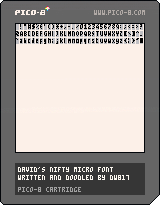
Here is the current one I put together. Can you improve on this, make it more legible without losing its thin size ? It might be a group effort.
|
|
[8x8] |

@dw817 I love that custom font of yours! It looks compact, and it is very readable. However, I did take the liberty of creating my own version of the font that changes a few characters I didn't like (I especially wanted the capital I and lowercase L to be distinguishable from one another), as well as gets rid of the descenders (thereby making it "shorter").

|
[0x0] |
In addition, I've created my own cycle-optimized functions to print the font (this was designed and encoded in a private custom font encoder cart).
function init_thin()
 local font,j="1001e83c0303fabe3d7ec391123556e1c0274428b83abaa32388208822101083111037c7c34fc239d5238d74332ae3ed643756439d30355743455c15020a82228252825102af03325a37d1e3fd542fc43fc5c2fd42fd03746e3f93e38fe228f83f9362f843fb3e3fc1e3745c3fd10374de3fd1626d8387e03f07e3f0fc3f9be3d9363e1f82be43ffe23410438ffe344102084282025bc2fbc27a427fc27b427a826bc3fa1e1b820dc3f9921f837b1e37a0e37a5e27b8273c27a026ac2fa43705e370dc378de349923695e25b4323a21d838b88346203fffe",1
 thinf={}
 for i=1,96 do
  local ch,bits,w,tf=sub(" !\"#$%&'()*+,-./0123456789:;<=>?@\65\66\67\68\69\70\71\72\73\74\75\76\77\78\79\80\81\82\83\84\85\86\87\88\89\90[\\]^_`abcdefghijklmnopqrstuvwxyz{|}~\127",i,i),"",sub(font,j,j)*5,1
  thinf[ch]={}
  while #bits<w do
   j+=1
   local num="0x"..sub(font,j,j)
   for k=0,3 do
    bits=bits..(band(1,shr(num,3-k)))
   end
  end
  j+=1
  while #bits>=5 do
   local ar={}
   for k=1,5 do
    ar[k]=sub(bits,k,k)
   end
   thinf[ch][tf]=ar
   tf+=1
   bits=sub(bits,6)
  end
 end
end

function print_thin(s,x,y,c,d)
 local xx,yy,ch=x,y-1
 for i=1,#s do
  ch=sub(s,i,i)
  if ch=="\n" then
   yy+=6
   xx=x
  else
   --if (not thinf[ch]) ch="\127"
   --uncomment that line to
   --make all non-printables █
   for cs in all(thinf[ch]) do
    for rw=1,5 do
     if cs[rw]=="1" then
      if (d) rectfill(xx,yy+rw,xx+1,yy+rw+1,d)
      pset(xx,yy+rw,c)
     end
    end
    xx+=1
   end
   xx+=1
  end
 end
end |
Here is an example of the font being used to create a wall of text.
(If you add an optional argument, it also generates a "shadow" like yours!)
I am really liking what you did here, @JWinslow23 ! :D
With your kind permission I'd like to use your upgraded font in the final bookreader-writer project with your credits.
Goggles ! I hadn't considered using a simple 2x2 rectangle for the shadow instead of plotting each individual pixel as I'm doing now. Nice job ! I definitely need to update my code to that.
... Wow ! That rectangle really sped things up. Not sure what I was thinking plotting a single pixel at a time for the shadow.
Your TF,Sub is also very good. I knew that at some point I needed to sit down and convert all that \32\33\34\35 nonsense etc. to actual normal and raw characters, the ones that could be encoded neatly in the source.
Looking at your plotter. Yes, it would probably take far less memory to use "1" instead of TRUE as I am now. Let's test that:

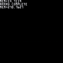
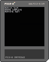
It does take more memory, but not by much it seems.
Set array of 32768 size with following value encoded, memory taken:
-- true = 270.7627
-- 1 = 270.7598
-- "*" = 270.7793
I thought TRUE and FALSE would be encoded as bit data which is why I use them for the most part. Apparently not as they take the most amount of space. I may want to rethink and start using true 1's and 0's when applicable for my logic instead to save memory.
Curious. Testing one other thing.
-- "true" 270.7646
No, I thought maybe @zep was encoding a string of "TRUE" for boolean but he's not.
Still, let's look at that for a second.
Memory is 14.7148 to start.
Memory is 270.7646 after 4-letter array is complete.
Maximum value for stat(0) is 2048 (likely 2047.9999) but that's fine, 2048.
So let's calculate by character how big the array is.
"true" 4-letters * 32768 = 131072-bytes actual.
Memory of 270.7646-14.7148 = 256.0498 actual size for single array. So to calculate, 2048/256 (remove trailing) gives 8. So there is enough memory in Pico-8 to do =8= times an array with 4-chars in size for each of the 32768 elements ... yielding close to 1,048,576 individual bytes of memory available to store !
Ka-phew ! That's some serious RAM for gaming ! I had worried sometimes about running out of memory but it seems that is not a problem, at least with the coding I do which I try to keep compact.
Regarding your font. Hmm ... it's not using 8-pixels vertically so, yeah, it's not going to be easy for novices to edit that proprietary format. The purpose is so anyone can make changes to the font.
I'll write a convert shall I ?
And some good ideas you did on the font, you did a nice job here of converting the descenders. Let me add a few of my own, to & and lowercase y. Everything else looks pretty sharp.
|
|
[8x8] |
. . .
Another discovery. Apparently RECTFILL() is faster than RECT().
repeat
  cls()
  ?stat(1)
  flip()
  for i=0,255 do
    rect(0,0,127,1)
  end
until forever
|
Change that to rectfill() to see difference. Okay. So if I'm drawing a filled rectangle with an X-size or Y-size of 2 or less, while you would think rect() would be faster, it's not. Will change my code to reflect rectfill() whenever possible.
And we're about ready for an update to the bookreader ! Probably tomorrow. Going to change BNTP() to BTN() to show just how fast it runs now, and boy does it !
@dw817 Yes, you do have my permission to use my modified font (and your own plotter/converter for other people to edit it).
The reason I chose "1" as my pixel-plotting conditional is because I decode the bits in the font as bitstrings due to the ease and speed of appending bits, and removing bits from the beginning in order to add to my font cache. I'd tried using a table of strings (and a table of true/false values), but they added to the setup time without giving too much of a performance benefit.
One thing I did notice, however, is that if you optimize the function for never displaying shadows (if you plan never to use the shadow in whatever application you have for it) - which you would do by putting a color(c) before the character loop and omitting the color argument of pset - there is a very substantial performance boost. Those who plan to use this font without a shadow might want to modify the code thusly.
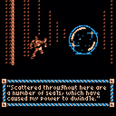
I've made many different kinds of converters/displayers for many different kinds of fonts. For example, I have a "Pray For The Wicked" font that's based on sprites, variable-width, and unpacked in the spritesheet and meant to be optimized for CPU. (I added a gray shadow just for kicks!)
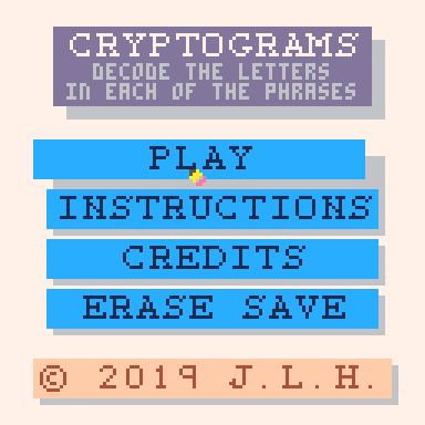
I made a custom large font for my Cryptograms! game that's also based on sprites and unpacked in the spritesheet, but this time it's monospaced.
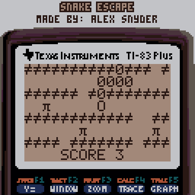
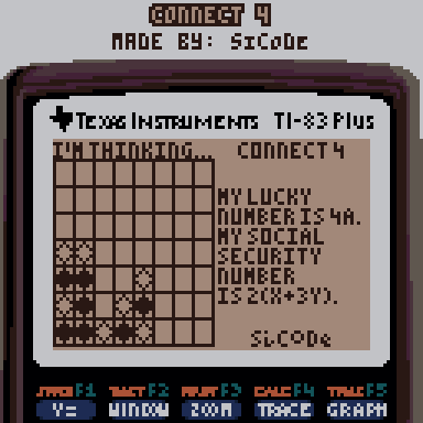
I made a custom font for Egypt (based on a font that I had encountered on the TI-83+; it's even called print_ti internally) which was variable-width and based on psets. Even though it was variable-width, all of my font characters were so small that all of their bits could fit into one PICO-8 number, and what I ended up doing was grabbing the data for each character in real-time and converting it to a number so I could loop through its bits. Not the most CPU-efficient way, but hey, I only had a week to complete the game, and it worked well enough.
And for my as-of-now-unreleased series of carts called "Classic TI Series", I've implemented two different fonts to emulate those of the TI-83+: one large monospaced font, and one small variable-width font. Both are encoded similarly, and both use pretty much the same "pset-caching" method I used in that function I gave you as an example (though as I'm developing the full library, this may change to sprite-based if CPU time requires).
What I'm trying to say here is, I convert the data for these fonts in a very similar way, in carts such as this where all of the sprites are replaced with same-height rectangles with the font data in them and their bits are encoded pixel-by-pixel. The encoding format and decoding process simply vary slightly by implementation.
Would you perhaps like it if I were to combine some of my different font converters into one novice-friendly converter for my style of font? It might be very interesting to play around with.
Oh, and here's a version of the font with your suggestions for changes (which I do agree with).
function init_thin()
 local font,j="1001e83c0303fabe3d7ec39112355661c0274428b83abaa32388208822101083111037c7c34fc239d5238d74332ae3ed643756439d30355743455c15020a82228252825102af03325a37d1e3fd542fc43fc5c2fd42fd03746e3f93e38fe228f83f9362f843fb3e3fc1e3745c3fd10374de3fd1626d8387e03f07e3f0fc3f9be3d9363e1f82be43ffe23410438ffe344102084282025bc2fbc27a427fc27b427a826bc3fa1e1b820dc3f9921f837b1e37a0e37a5e27b8273c27a026ac2fa43705e370dc378de34992368dc25b4323a21d838b88346203fffe",1
 thinf={}
 for i=1,96 do
  local ch,bits,w,tf=sub(" !\"#$%&'()*+,-./0123456789:;<=>?@\65\66\67\68\69\70\71\72\73\74\75\76\77\78\79\80\81\82\83\84\85\86\87\88\89\90[\\]^_`abcdefghijklmnopqrstuvwxyz{|}~\127",i,i),"",sub(font,j,j)*5,1
  thinf[ch]={}
  while #bits<w do
   j+=1
   local num="0x"..sub(font,j,j)
   for k=0,3 do
    bits=bits..(band(1,shr(num,3-k)))
   end
  end
  j+=1
  while #bits>=5 do
   local ar={}
   for k=1,5 do
    ar[k]=sub(bits,k,k)
   end
   thinf[ch][tf]=ar
   tf+=1
   bits=sub(bits,6)
  end
 end
end

function print_thin(s,x,y,c,d)
 local xx,yy,ch=x,y-1
 for i=1,#s do
  ch=sub(s,i,i)
  if ch=="\n" then
   yy+=6
   xx=x
  else
   --if (not thinf[ch]) ch="\127"
   --uncomment that line to
   --make all non-printables █
   for cs in all(thinf[ch]) do
    for rw=1,5 do
     if cs[rw]=="1" then
      if (d) rectfill(xx,yy+rw,xx+1,yy+rw+1,d)
      pset(xx,yy+rw,c)
     end
    end
    xx+=1
   end
   xx+=1
  end
 end
end |
As for your converter tool, yes please.
Oh ! I didn't see the font was included in the first code, and didn't run it. I see it is here.
Okay, yeah, works:
function main()
cls()
init_thin()
print_thin("hello there.",0,0,7,0)
print("",0,999)
end
|
I was looking at your "g" for that Pyramid game, @JWinslow23. One of these might suit better and you're welcome to them.
|
|
[8x8] |
|
|
[8x8] |
Either of the 4.
Quite a bit of font work you're doing there !
Years ago I dabbled on the Apple ][ and made a bunch of 7x7 images and fonts, I may resurrect that for Pico-8 as that would gain me 2-additional tiles across and down yielding 18x18 7x7 tiles with only 1-pixel missing from each edge (126x126).
I also sold Font Album #1 and Font Album #2 for the Apple ][+ years ago making use of HRCG Hires Character Generator where you could have fonts that were 7x8 and 14x16.
On the IBM-pc, I made a a whole bunch of fonts all different sizes and shapes for QBasic and GFA. Here's a wide-one I put together more than 25-years ago.

Tomorrow I'll post the update for the bookreader, and I'm not kidding, that RECTFILL() command sure helps a lot and it runs FAST now. :D
Days to follow I'll post a version that reads text only from a string (not memory) that includes its own natural upper/lowercase letters. No guesswork in the code. It'll be simple to do and invoke.
@dw817 The font for that game was based on an already existing font that I didn't want to change, but thanks for those suggestions!
As we were talking earlier about intelligent pixels, you might be interested in this article I wrote recently:
https://www.lexaloffle.com/bbs/?tid=35692
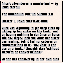
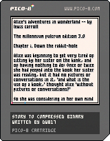
Also, I have indeed updated my Book Reader, even gave it a bit of a logo. I know, I'm not good with drawing curves or lines at angles yet as clearly THIS looks more like a book.
![]()
I wonder if it would be possible to doodle up a line drawing program that allows you to add a curve to it so when it completes, it ends up in the correct x2,y2 position.
For instance if you drew a horizontal line, you could add some arguments to it.
CLINE(x1,y1,x2,y2,angle,strength)
And it would always return back to x2,y2 no matter what angle or curve you chose, like the two slopes at the bottom of the book icon above.
Just for kicks, I've created an alternate version of that font-displaying code for when token count is to be optimized instead of render speed.
function init_thin()
 thinf={}
 for i=1,95 do
  thinf[sub(" !\"#$%&'()*+,-./0123456789:;<=>?@\65\66\67\68\69\70\71\72\73\74\75\76\77\78\79\80\81\82\83\84\85\86\87\88\89\90[\\]^_`abcdefghijklmnopqrstuvwxyz{|}~\127",i,i)]=tonum("0x"..sub("000000170c037d5f37eb488966aa0003022e01d155d511c401100084001008883e3e43f24ab92eb1754c26b726ae0cb92eaa3aa2000a01500144014a008a00f55a4c78be2abf023f3a3f02bf00bf762e7c9f47f101f16c9f021f7cdf783f3a2e08bf7b2e68bf01b607e17e0f3f0f7d9f6c9b1f87027d47ff20827ff108220210004103da03df025e03fe02de015e03d6785f001d03b0499f001f78de705e7a5e01de03ce005e0356025f7a0e3b0e7b1e49923b1602da45c4001b11d10462",i*4-3,i*4))
 end
end

function print_thin(s,x,y,c,d)
 local xx,yy=x,y-1
 for i=1,#s do
  local ch=sub(s,i,i)
  if ch=="\n" then
   yy+=6
   xx=x
  else
   local cs=thinf[ch] or 0x7fff
   repeat
    for rw=1,5 do
     if band(cs,1)==1 then
      if (d) rectfill(xx,yy+rw,xx+1,yy+rw+1,d)
      pset(xx,yy+rw,c)
     end
     cs/=2
    end
    xx+=1
   until cs<1
   xx+=1
  end
 end
end |
This basically turns each character into a 15 bit number, and loops through the bits column-by-column 5 at a time until there are no more bits to iterate over. (In the case of the space, instead of stopping iteration right away it always iterates over the first column. An interesting thing to note is that this code depends on there being no blank column to the right side of any characters, unless it is the only column, so that makes this sorta font-specific.)
As far as I know, this is the best solution for those looking for a token-efficient way to have this same thin custom font we've talked about; it offers a saving of 80 tokens for a minimal CPU time increase. (As an added bonus, it handles non-printables very gracefully.)
Of course your project will probably prioritize speed over token count, but I'm putting it here because I have nowhere else to put it for now.
No, that's fine, JW. It's quite good. Now - how do you handle word-wrap ? That was a bit of a nightmare for me and yet ... I'm thinking I want to make it have an option so it does an equalize spacing, that is, it spaces out the single text line using the entire margins by adding blank pixels between words.
I think it's called full justification.

Well, in my own book reader I encoded the word wrap in the book data itself. I'm sure that you can somehow get the width of the next word and either write it or not based on whether it extends past the edge. Not sure the best way to do justification, though.
I know exactly how to do it. Math. :)
Not now, Sunday is getting busy over here, but maybe sometime later Monday I'll scribble out the method and code for it.
And THAT version will not use sprite space but direct text variable. So someone can enter a story bigger than 12288-compressed bytes if they so choose.
Maybe by Friday I'll have a little folder system where you can store and read your favorite short stories. Who knows. :)

Cool! Do you work on the design all by yourself? Or have you been collaborating with any designer?
game dev enthusiast and programmer at Studymoose; website, where you, quickly, can buy cheap essay papers for college or university. When I have free time, I travel mostly. I have been total in 13 countries.
Hi @WallacePrio. Well I was working on the design by myself but as you can see I was influenced in changing my font with the help of @JWinslow23.
The idea of lowercase letters a, b, d, e, g, p, and q being only 2-pixels across, however, is an old idea I had when I saw some very small copyright print on a videogame back on the Apple ][ computer.
At the time their font was a perfect 3x7 pixels yet I wanted to make my own font where lowercase letter i, j, and l were just 1-pixel wide.
By doodling in this smaller across font, I just accidentally came across how well other lowercase letters like abdegpq looked at 2-pixels across instead of 3.
While my program ran very slowly being in Applesoft BASIC and using the HPLOT command, I showed it to Dad and he was impressed that the text was still quite legible despite many of the letters now only being 2-pixels across.
It is from that work then that I applied to today for Pico-8's own very small resolution and the final release of my Book Reader seen above.
. . .
To answer your question, In general I work solo. Sometimes someone wants to "hire" me, usually for coding. But it is often the same problem.
The company I'm working for wants to "advance" - to go to a new programming language I don't like - and because I won't accept the change, I'm out.
I will always come back to Pico-8, however.
It is a language I like, it is strongly driven by keyboard, a big plus with me, runs instantly by pressing CTRL+R, no compilation time at all - also a big plus with me, and only requires use of the mouse for drawing sprites and crafting maps.
[Please log in to post a comment]