


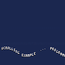
Some parts could be coded a little better, but this should give you an idea of how to create a sinus scroller like you'd see in demo programs.

Nice.
Note: sinus scroller usually shifts pixel rows up and down (not just the whole letter) - that’s the real demo effect!
I find this effect better to be honest ... I like the chunkiness of doing entire characters. Both are valid tho.

Yeah, shifting pixel columns up and down only works well with fatter fonts. With fonts that have pixel-wide strokes, it gets kind of ugly. Like, on C64 demos I remember, the fonts for the wavy greets were usually about 12 or 16 pixels tall with double-width strokes.
I guess if the dy from one column to the next is never more than 1 pixel it ought to be reasonably okay.
[Please log in to post a comment]