


Press the up/down arrow keys
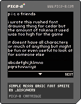
As the title states!
This isn't optimized at all, an exercise for the reader.
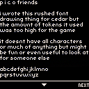
I drew the letters myself, as sprites, hence their existence in
the sprite sheet. Those are so you can swap either/or, and trade
sprites for code space and performance.
Have fun!
I threw the file on github as well
p.s The CC license isn't really applicable but I wasn't sure if NOT selecting it would imply you can't use it at all and now I can't edit that out it seems. The github repo has it as MIT license - you can do whatever you want with this!


Great idea on the anti-aliasing! Have you tried making it use more of the grays to achieve even smoother and more readable text?
I tried a few things yea, the density of the text in the display format (basically what I had there) fits the amount of reading per page, cpu I could spend, and contrast I was going for visually :) In other use cases I could imagine even tighter AA, worth a try!
[Please log in to post a comment]