


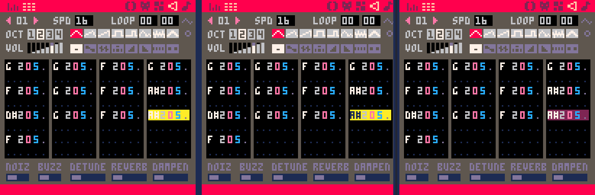
In the music editor, note names are displayed in white, which makes them extremely difficult to read when selected due to the poor contrast with the yellow highlight color. This makes tasks like transposing selected notes a bit of a guessing game.
Legibility would be significantly improved if the note name was inverted when selected or if the highlight color was changed.
[Please log in to post a comment]