I’m a low-vision developer who recently fell head-over-heels for Pico-8 and Picotron—honestly, the low-res aesthetic is a game-changer for central vision loss. With fewer pixels and tight constraints, these platforms are some of the most playable and buildable game dev environments I’ve come across.
That said, I’ve been running into some accessibility bumps—especially with the IDE tooltips. The red-on-brick-red color scheme is tough to parse, and jumping my gaze from one side of the screen to the other really adds up in eye strain over long sessions.
Here’s my wishlist:
• Screen reader support: If tooltips and field labels had ARIA tags or other hooks for screen readers, I could fly through tools without as much visual fatigue.
• Retro screen reader mode: Even better? Imagine a built-in reader that sounds like an old-school ’80s computer voice. Bleeps, bloops, the whole vibe. Functional and fun.
I know accessibility work takes time, but even a small tweak—like upping the contrast on tooltips—would go a long way. I’d love to hear if others have worked around this or if it’s on the roadmap.
Thanks for making such a magical little machine.

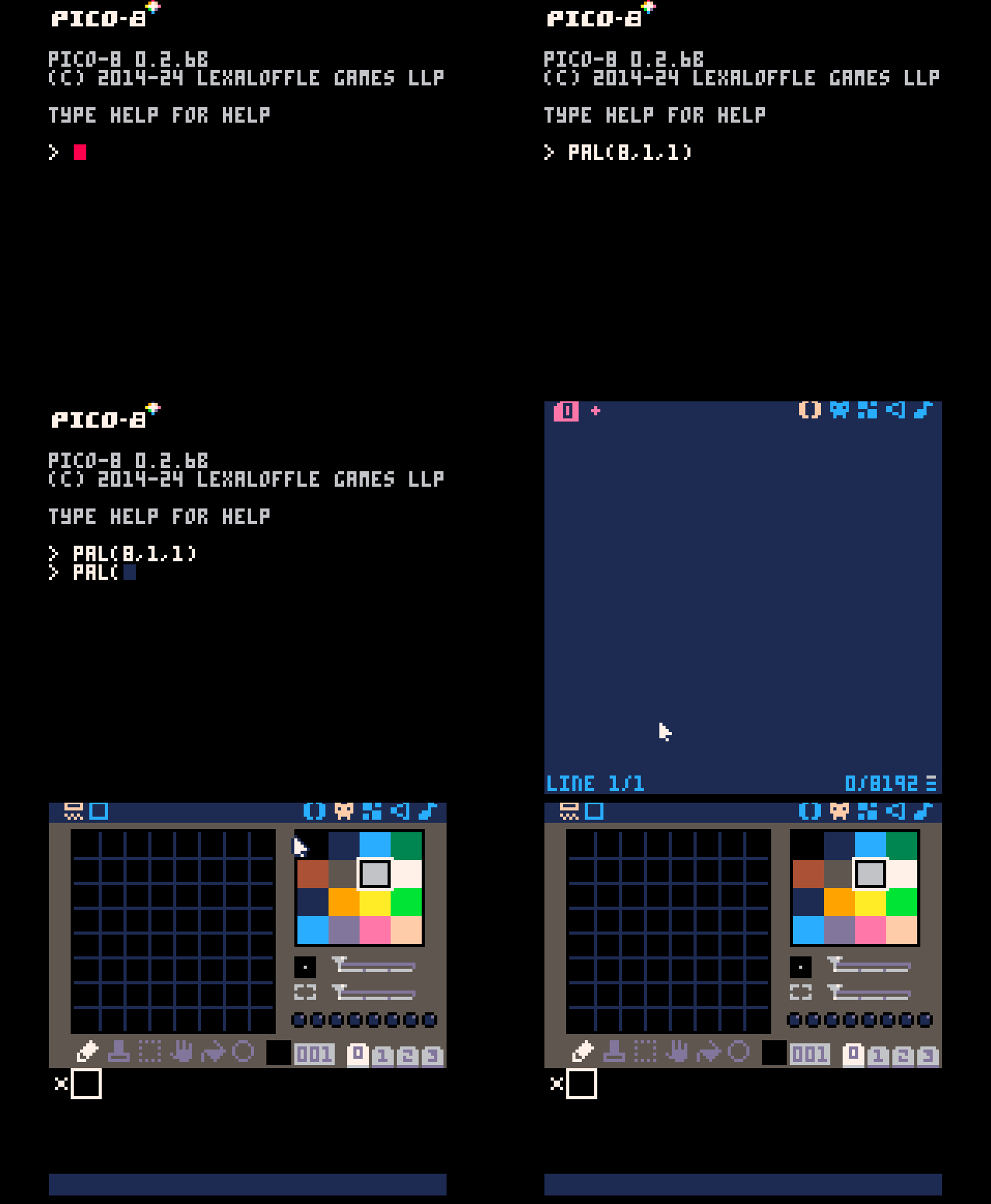
I was originally going to suggest that you can change the IDE color scheme by running a couple of PAL() calls on the command line before entering the IDE. But it turns out that even though most of the IDE is affected, the tooltips don't respect the changes made by the PAL() calls and are always the purple-on-red color. I think maybe that should be considered a bug, but maybe it's intentional for some reason.


I’ve programmatically set the entire IDE to black by mistake, and was very glad for the coloured tooltips that helped me save the WIP, so I’d say it’s probably unchangeable by design for that reason.
Maybe there’s a hidden poke or extcmd parameter to change that ?
[Please log in to post a comment]


