


Here's some code to add a old CRT monitor effect over your HTML-published carts.
I read an article recently about how low-res graphics looked better/softer on old CRT monitors and TVs, so did some googleing and found an effect you can apply via Cascading Style Sheets to your HTML-published game.
When you've export my_game.html open up the .html file in a text editor and add the following inside a STYLE tag near the top of the file:
  @keyframes flicker {
  0% {
    opacity: 0.27861;
  }
  5% {
    opacity: 0.34769;
  }
  10% {
    opacity: 0.23604;
  }
  15% {
    opacity: 0.90626;
  }
  20% {
    opacity: 0.18128;
  }
  25% {
    opacity: 0.83891;
  }
  30% {
    opacity: 0.65583;
  }
  35% {
    opacity: 0.67807;
  }
  40% {
    opacity: 0.26559;
  }
  45% {
    opacity: 0.84693;
  }
  50% {
    opacity: 0.96019;
  }
  55% {
    opacity: 0.08594;
  }
  60% {
    opacity: 0.20313;
  }
  65% {
    opacity: 0.71988;
  }
  70% {
    opacity: 0.53455;
  }
  75% {
    opacity: 0.37288;
  }
  80% {
    opacity: 0.71428;
  }
  85% {
    opacity: 0.70419;
  }
  90% {
    opacity: 0.7003;
  }
  95% {
    opacity: 0.36108;
  }
  100% {
    opacity: 0.24387;
  }
}
@keyframes textShadow {
  0% {
    text-shadow: 0.4389924193300864px 0 1px rgba(0,30,255,0.5), -0.4389924193300864px 0 1px rgba(255,0,80,0.3), 0 0 3px;
  }
  5% {
    text-shadow: 2.7928974010788217px 0 1px rgba(0,30,255,0.5), -2.7928974010788217px 0 1px rgba(255,0,80,0.3), 0 0 3px;
  }
  10% {
    text-shadow: 0.02956275843481219px 0 1px rgba(0,30,255,0.5), -0.02956275843481219px 0 1px rgba(255,0,80,0.3), 0 0 3px;
  }
  15% {
    text-shadow: 0.40218538552878136px 0 1px rgba(0,30,255,0.5), -0.40218538552878136px 0 1px rgba(255,0,80,0.3), 0 0 3px;
  }
  20% {
    text-shadow: 3.4794037899852017px 0 1px rgba(0,30,255,0.5), -3.4794037899852017px 0 1px rgba(255,0,80,0.3), 0 0 3px;
  }
  25% {
    text-shadow: 1.6125630401149584px 0 1px rgba(0,30,255,0.5), -1.6125630401149584px 0 1px rgba(255,0,80,0.3), 0 0 3px;
  }
  30% {
    text-shadow: 0.7015590085143956px 0 1px rgba(0,30,255,0.5), -0.7015590085143956px 0 1px rgba(255,0,80,0.3), 0 0 3px;
  }
  35% {
    text-shadow: 3.896914047650351px 0 1px rgba(0,30,255,0.5), -3.896914047650351px 0 1px rgba(255,0,80,0.3), 0 0 3px;
  }
  40% {
    text-shadow: 3.870905614848819px 0 1px rgba(0,30,255,0.5), -3.870905614848819px 0 1px rgba(255,0,80,0.3), 0 0 3px;
  }
  45% {
    text-shadow: 2.231056963361899px 0 1px rgba(0,30,255,0.5), -2.231056963361899px 0 1px rgba(255,0,80,0.3), 0 0 3px;
  }
  50% {
    text-shadow: 0.08084290417898504px 0 1px rgba(0,30,255,0.5), -0.08084290417898504px 0 1px rgba(255,0,80,0.3), 0 0 3px;
  }
  55% {
    text-shadow: 2.3758461067427543px 0 1px rgba(0,30,255,0.5), -2.3758461067427543px 0 1px rgba(255,0,80,0.3), 0 0 3px;
  }
  60% {
    text-shadow: 2.202193051050636px 0 1px rgba(0,30,255,0.5), -2.202193051050636px 0 1px rgba(255,0,80,0.3), 0 0 3px;
  }
  65% {
    text-shadow: 2.8638780614874975px 0 1px rgba(0,30,255,0.5), -2.8638780614874975px 0 1px rgba(255,0,80,0.3), 0 0 3px;
  }
  70% {
    text-shadow: 0.48874025155497314px 0 1px rgba(0,30,255,0.5), -0.48874025155497314px 0 1px rgba(255,0,80,0.3), 0 0 3px;
  }
  75% {
    text-shadow: 1.8948491305757957px 0 1px rgba(0,30,255,0.5), -1.8948491305757957px 0 1px rgba(255,0,80,0.3), 0 0 3px;
  }
  80% {
    text-shadow: 0.0833037308038857px 0 1px rgba(0,30,255,0.5), -0.0833037308038857px 0 1px rgba(255,0,80,0.3), 0 0 3px;
  }
  85% {
    text-shadow: 0.09769827255241735px 0 1px rgba(0,30,255,0.5), -0.09769827255241735px 0 1px rgba(255,0,80,0.3), 0 0 3px;
  }
  90% {
    text-shadow: 3.443339761481782px 0 1px rgba(0,30,255,0.5), -3.443339761481782px 0 1px rgba(255,0,80,0.3), 0 0 3px;
  }
  95% {
    text-shadow: 2.1841838852799786px 0 1px rgba(0,30,255,0.5), -2.1841838852799786px 0 1px rgba(255,0,80,0.3), 0 0 3px;
  }
  100% {
    text-shadow: 2.6208764473832513px 0 1px rgba(0,30,255,0.5), -2.6208764473832513px 0 1px rgba(255,0,80,0.3), 0 0 3px;
  }
}
.crt::after {
  content: " ";
  display: block;
  position: absolute;
  top: 0;
  left: 0;
  bottom: 0;
  right: 0;
  background: rgba(18, 16, 16, 0.06);
  opacity: 0;
  z-index: 2;
  pointer-events: none;
  animation: flicker 0.15s infinite;
}
.crt::before {
  content: " ";
  display: block;
  position: absolute;
  top: 0;
  left: 0;
  bottom: 0;
  right: 0;
  background: linear-gradient(rgba(18, 16, 16, 0) 50%, rgba(0, 0, 0, 0.25) 50%), linear-gradient(90deg, rgba(255, 0, 0, 0.06), rgba(0, 255, 0, 0.02), rgba(0, 0, 255, 0.06));
  z-index: 2;
  background-size: 100% 3px, 3px 100%;
  pointer-events: none;
  backdrop-filter: blur(0.4px);
  mix-blend-mode: color-burn;
}
.crt {
  animation: textShadow 1.6s infinite;
}
|
Then find the line id="p8_playarea" style="display:none; margin:auto; and change it to add a class of 'crt' like this: id="p8_playarea" class="crt" style="display:none; margin:auto;
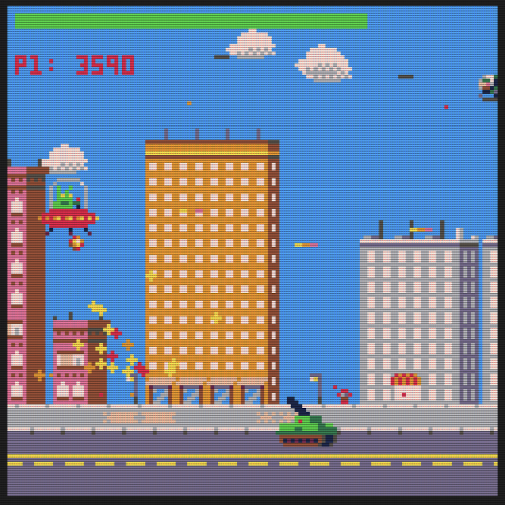
You can see a working version here: https://steveattewell.com/alien/index_crt.html
Go there and "view source" to see how it's done.
I adapted this code to get the effect working: https://aleclownes.com/2017/02/01/crt-display.html and did some tweaks and added some blur.
[Please log in to post a comment]