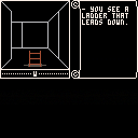
LAST UPDATE maybe: minor fixes and controller changes for more compatibility, see this post for the rundown
UPDATED UPDATE: 2.0 with automap and tons of other changes! See this post for details
UPDATE: 1.1 RELEASE! See my post somewhere down below detailing what's new/changed
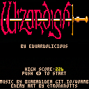
What started as an attempt to recreate a Wizardy-style dungeon crawl sorta morphed/evolved into it's own thing. So, now it's Wizardish!
Featuring:
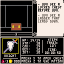
- eight 16x16 dungeons
- grid-based movement/turn-based combat system
- four selectable characters with various stats/perks
- chests with gold, potions, and maybe a trap
- full UI with message system, stats, step tracking, and time played
- cartdata for highest loot run
- sounds by me, music by 0xabad1dea
- more stuff that i'm probably forgetting
Everything is complete at this point and I'm pretty happy with it all (other than the incredibly ugly monster sprite. I don't know how anyone here makes the amazing pixel art they do). I am curious about balance/difficulty though..I can complete the game with all four classes, but I'm not sure how much of that is down to me having drawn the maps lol. Would be very interested in everyone's feedback for possible rebalancing
thanks to 0xabad1dea for the Castle Ruins tune posted originally at https://www.lexaloffle.com/bbs/?tid=3531 it was a really great fit and makes the whole thing feel way more professional than it should
Enjoy!
original WIP post below:
Mostly posting this here just so I don't lose it if my hard drive dies or something lol. But also interested in feedback if anyone sees any weird mistakes with the wall drawing logic.
Got an itch to play Wizardry I again, then while I was farting around with it realized it's pretty basic to replicate the 'engine' all things considered. Started messing around with it and a day or so later here I am. Probably going to keep working on this and make an actual game out of it..just need to decide if i want to go with handcrafted maps/scenarios or something randomized. We'll see!
As it stands now you can walk around with the arrow keys, and your scroll will update with info anytime something is in the same block as you (and eventually scroll out). Nothing actually interactable yet, no fights etc.

Nice approach - just one word of warning, you will most likely run out of tokens before finishing a RPG on Pico-8, I'm speakting of experience here. Either you keep it really, really simple or you need to go for an multi cartridge approach, as I did.
Would love to see more RPGs on Pico-8 :)

thanks everyone!
and yeah..i ate about 2200 tokens just to get this far, and i thooought i was being pretty conservative. woops lol
for something on the scale of wizardry though, i might be able to make a small party with a simple ruleset fit. we'll see. or a single character? who knows.
if i randomize enemies and reuse arrays i might be able to stretch that i think as well. fingers crossed!

In my case, the worlds infrastructure, e.g. shops, review board, temples, ate a lot of tokens, so if you can work around such things and you keep the battle system extremly simple, you might get a bit further. Currently, my game spans three cartridges, with almost 30kb game meta data alone. I'm still struggeling with the tokens...

have been working on this all week and enjoying it a lot, so figured id post an update. whats new:
- selectable character classes
- two working 16x8 floors (using sprites as map data instead of manually creating arrays)
- finished (maybe) interface
- step/time tracking!
- openable chests of gold
- climbable ladders
- drinkable potions (even though you can't take damage yet)
- a lot of logic/token trimming. sitting at about 2600 now compared to 2200 before despite tons of progress
still to come:
- sprites that arent laughably awful. i can't draw. this is a problem lol
- combat/monsters (toying with randomized vs set locations)
- thinking 8 floors of 16x16 maps. feels like a nice round number
- variations in char stats instead of set stats per class for replay variety
- variety of loot (potions, random gold, maybe traps?)
- some sort of end goal maybe? ionno
i think i can make all that fit anyway. we'll see!
edit: oh yeah need to make a title screen too lol

update! things that are in now:
-combat!
-eight 16x16 floors!
-stats! (that might need balanced)
-loots!
-ending screens for winning and dying!
so at this point the game itself is feature complete! just need to get some not-oh-my-god-i-cant-draw sprites in place for character portraits and enemies and a title screen, and it'll be ready for release!

1.0 release posted! would love to hear everyone's feedback on difficulty/balance between the character classes
i think i might have accidentally screwed up and uploaded the cart like three times but i think thats sorted now
also apologies in advance for the ugly monster. not my strong suit haha

You can jam a lot of data into the map/sprite sections if you're comfortable with treating colors as bytes (0xFF would be cream/cream, for example), then deserializing it into actual objects/tokens on init.
I was actually thinking of demaking a simpler clone of Mordor and was just considering how to handle a lot of data.
What I was going to do for directional movement was to flag each tile as allowing NESW movement, such that N=1, E=2, S=4, W=8, so if a T-shaped tile allowed you to move left, right, or down, it would be represented as "14", or pink.

Pretty cool, made it to level 7 on my first run, not making maps or anything, just wandering around.

t Danjen, yeah thats pretty close to what I ended up doing (this thread was just moved from WIP), albeit without the abstraction layer
basically every turn checks player position in the array, and while drawing walls/objects just does an sget on floor[posx][posy] to see whats on the spot youre standing on, or floor[posx+1][posy] for whats one block away, etc etc
i think my wall drawing logic could be cleaner (i should have worked from background to foreground instead of vice versa), but it seems to work at least so far as i havent noticed any odd walls that are drawn incorrectly

oops minor bugfix release
(the string that said HOW to attack wasnt actually displaying. woops lol)

I would just like to say, I'm very impressed with this game. Simple in design, complex in execution. I love it. Can't wait to see what's in store for the future of Pico-8!

thanks! i'm glad people like it! (tho i'm still not sure if anyone can actually BEAT it lol)

Btw, posted a review of the game. Hope you don't mind.

Take some piece of paper and draw them yourself - its fun, I did it a lot in the old Bard's Tale times...

yep thats how we used to play these games when we walked uphill both ways in the snow etc etc
(if you really want to cheat you can look at the sprite sheet, the maps are in there)

Man this is amazing! Could something like this be conceivably expanded upon with more enemies and an inventory or this about as far as it can be pushed?

theres still plenty of room code/token/whatever-wise really, so a lot of functionality could be added. i mostly kept it simple just because of the fact you've only got a couple buttons and so much screenspace to work with
also the sprite sheet is pretty full but a lot of that is wasted on things like titlescreen, class icons, etc. getting rid of those would allow more space for other enemy types, plus palette shifting for even more. would also free up room for more floors of the dungeon but honestly it's probably already too hard to get through lol

My friend Jonathan threw together a COMPLETELY NOT TERRIBLE enemy sprite, complete with animation, so figured it was deserving of a big update!
Since I was putting that together, I made some balance changes as well since near as I could tell nobody was actually finishing the game. Finishing should be a bit easier now, which can put more emphasis on score chasing. Here's everything that's new:
- new enemy sprite (and animation cycle!)
- rebalanced hp/defense for each class to try to increase survivability a bit
- rebalanced potion hp gain and boosted cleric's bonus
- made traps only go off once if you trigger them. this was TECHNICALLY a bug, but i liked it. everyone said it was too mean and didn't make sense though which I GUESS is true so, it's fixed now. huffs
that's it for now. hopefully nothing that could cause any new bugs to crop up but if anything seems odd (or if it now seems TOO easy), let me know
and if you managed to finish it on v1.0/1.01 without cheating and looking at the maps in the spritesheet, well..good job! consider that 'Hard Mode' i guess

woops screwed up my upload, man im bad at that
should be right version now

I picked Cleric, and essentially walked through the dungeon to the exit. The Pseudo 3D is a cool effect, but I didn't feel like the gameplay had enough mechanics to fill 8 floors with something interesting. There are 2 things in this dungeon: goblins, and chests (and you can't see them until you're on their square). Neither of these proved to be a challenge. Still, good job making the mazes work. I might peek at your code if I ever wish to make a similar game. :)
I will say this: The mazes were often designed with a lot of loops and gridlike halls which forced me to concentrate pretty hard so I wouldn't get lost; the Left-Hand Rule doesn't work here, which probably makes for better mazes.

yeah i think i might have made cleric/knight TOO easy in my rebalance. might need looking into..
in the meantime while i decide, 1.01 is still up for masochists

The issue I have isn't balance, it's more the lack of interesting obstacles.

different strokes i guess =)
us old timers lived for these things 30ish years ago. i do wish i could fit full party mechanics in but itd be a tight squeeze. maybe for Wizardish II!

This a nice way to do a first person game without wasting data, Only complaint is, It's hard to tell where you are because of how bland the map layout is. Everything looks the same and I get lost easily and feel as if I'm walking in circles without going anywhere.

gotta load up on graph paper and get mapping! ;)
im thinking about throwing together another update for this to fix the few last things that bother me (i.e. some classes being TOO easy now). might also screw around with the idea of being able to see chests/ladders from 1 square away but ionno, might feel cheaty and might ruin some of the maps. we'll see! if anyones got suggestions for a last round of tightening up i'm all ears
also my pocketchip just shipped! so might wait and see if this runs allright there and see if i need to change any controls for it

by popular demand, i'm in the process of adding an automap

right now i have it mapped to Q, and you don't HAVE to use it, but as long as it exists i think i might need to ramp difficulty up to make up for it
it doesn't give you the whole map, it just draws what youve explored, so its not really cheaty...but ionno. thoughts/suggestions?
im bummed that i wont be able to fit another button onto one controller though, so really it will only be useful to people playing on keyboards. if anyone has ideas around that though i'm interested

allright! i couldn't stop screwing around with it and now here's a big ol update that changes a bunch of stuff:
-AUTOMAP! hold Q to see a map that is filled in as you move, and keeps track of chests/ladders as you find them. you can technically play the game while holding Q but it'll be tough to see where you're going (sorry controller players, i was out of buttons on this one)
-PALETTE SWAPS! finally figured out the pal() command, so added a little variety to the enemies just for fun (enemy strength still determined by depth in dungeon)
-FEEDBACK IMPROVEMENT! slowed some animations and improved some feedback so it's easier to follow events as they happen in combat or with chests/traps
-BUGFIXES! i'm pretty sure this is all of them now? but who knows!
-REBALANCING! yes, again.. since automap removes some challenge, i've rebalanced enemy/player damage, how stats affect them, potion rates/effects, trap rates, and basically everything else. as always open to feedback if it's too easy/hard
-I THINK THAT'S IT! but i might be forgetting something

Really nice work. It's quite an impressive game given the limitations!
I have a suggestion for the automap that would make the game play more smoothly. I jumped into your code and added some logic to render the "walls" in each cell in the automap. This really helps with when you're playing to help find the places that you haven't explored yet. Because the current system just shows each cell on or off, you don't know where the other corridors you passed up earlier were, so you end up just wandering around looking for side passages, whereas if you can see where the walls and open passages are, you can quickly get to the places you haven't explored yet.
Here's a screenshot of what it looked like after I tinkered with it:
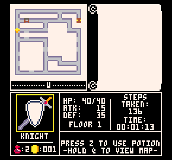
If you'd like the code I used to generate that image, let me know, and I'll share it, but it could probably be improved from the above. Currently, it looks like you're rendering the "explored" nature of the map by copying over a fully-rendered map with a fog of war. If you instead took that into consideration when rendering, you could draw those walls on the EXTERIOR of the cells instead of the INTERIOR of the cells, which would allow the ladder and chest icons to be less crowded.
Anyway, really cool work! Enjoying your game.

omg so, that is great. cuz i had been messing with ideas to make it work using fog of war instead of 'known wall' which is why my logic in there works like it does, but i couldn't get it to behave like i wanted and just dropped the idea and kept it as just path/wall. my original idea was three states per block and it just never clicked
id love to take a look at your idea, if you can stick a diff file or p8 somewhere. i might be able to make it work alongside my sprites i had for the original idea (basically, hazy/halftone blocks in unknown areas)

aw man i also just got my pocket chip and discovered the keys dont map to the expected keyboard keys? apparently z maps to 0, x maps to =, and i have no idea where the second controller is mapped so who knows where q is
this is going to take some thinking...

oh snap i figured out the map problem and it actually mostly behaves like the above suggestion now. going to clean it up a bit and hopefully have a release soonish
rolling in some bugfixes, ugly grammar fixes, and controls changes too while i'm at it

I'm always interested in RPGs. This is a great 3D one, Eduardo !
Suggest when you view MAP instead of a yellow circle, show the direction the player is facing with a small arrow.
Good job on displaying the direction the player is facing in text below, but maybe also display an arrow next to the word as an added hint.
I like what Nephilim suggested also. Much better map to see where you have and have not traveled.

thats a good point i hadnt thought of. turning the gold coin (which was originally supposed to just be a placeholder til i thought of something better lol) into a little compass shouldnt be too daunting

ok new version is up! i'm going to try to make this the LAST VERSION and move onto something else finally. here's whats new:
-
more useful automap (showing walls and compass direction)
-
several instances of bad grammar fixed gud
-
adjusted controls to fit on one controller again (and to allow for full compatibility with PocketCHIP)
- changed z/x references to glyphs to standardize across oddly mapped devices (i.e. the PocketCHIP)
if anything looks weird though let me know!

Noo ... Can't be last version ! I went and hacked through all the map and didn't see an exit. :D
Also, you might give the player a bonus when they explore the entire map. I spent several long minutes exploring areas over and over realizing that map was spent.
By Bonus, they did this for the GB-DS Final Fantasy 4. Once you have fully explored a map, you get a bonus - or - you could tell the player this and then randomly place an EXIT and double the random monster count.
That oughta be challlenging !
Also if you aren't familiar with how to build a random map, you could make the next levels sort of random using the original map data but with:
Mirrorx, MirrorY, Rotate Left, Rotate Right, Flip Over (180 degrees rotate right) which will give you 5-more levels to explore.
Also the exit for each level could be guarded by a BOSS monster, keep it challenging, Eduardo ! :)
Win the game and score according to how long you took to complete all levels, including moves per combat. Obviously people who memorize your map and can think on their feet will have a higher score.
If Pico-8 allows, keep track of top 10-players and display their names.

agh stop tempting me to keep workin on it lol. but good ideas for a sequel maybe..
tho if zep ever added shared cartdata there will DEFINITELY be a leaderboard update
(also as far as bonus goldgoes, right now the game is tuned so a 'perfect game' i.e. killing every monster/opening every chest will give you just enough gold so as not to roll over 999 and require me to fit a fourth digit in the UI haha)

No shared cart data ? Hmm ... That's definitely something that would be nice. I only found, I think it was 3-monsters once I tracked the whole maze. Just how much gold can you get from them ??
Maybe I missed some treasure on the mapping. :)

iirc level 1 has 3 monsters and 3 chests, and each level adds +1 monster and theres between 1-4 chests per level. then the 8th level is a crapton of both. i think its 25 chests and 50 monsters total? monster gold is ~10 per (slightly randomized) and chest gold is ~20 per (slightly randomized, but could also be a potion instead), so if you get no potions and 'best' randomization every time you'd come juuuust short of 1k at the end

yep, if you feel like cheating you can see where the ladder down on the first floor is in this post =)

Hey, you've made some changes. I liked the "Q" for mapping, gonna miss it as I sometimes use the BACK arrow to go back a step.
OK, I see the down stairs now. Hmm ! Got to play this again ! :)
Kinna stinks that PICO merges map data with tile data. I really have to wonder how much is nostalgia and how much is done to make it easier for ZEP to code.
We could at least not have shared memory on tiles and mapping.
Minju, I remember working on the Sinclair 1000. Amazing little computer. 1 & 1/2 k ! Memory was so tight that if you tried to fill the screen with black (as default was white), you would run out of memory 3/4 of the way as screen memory was merged with programming space !
Of course, at that point it truly was hardware limitations.
I also noticed you could hold the DOWN arrow key and still navigate. That would defeat the purpose of the 3D. Suggest if you view map you MUST release it before player can move again so mapping is not something to substitute for visual playing but only to assist for location.
As for items, if something is on the map and the player just moves past it, like treasure, or a ladder or something. Then maybe put a "?" on the map instead of the appropriate symbol. Then when the player views the map they will see the "?" and can go back to see what it was.
Once they actually activate the item, then it will appear as the proper icon on the map.
Your monsters do not appear to be random encounters but tiles that are fixed from one map to the next. I can't say for certain but I think the original Wizardry had true random encounters. That is, you walk and maybe a critter appears on the next touched tile every 5- or 10% of the time.
Made it to the next level. Music is the same ? Since music takes no space away from code, tiles, or mapping, suggest you have a new piece of music each level. Also different music for combat.
You mention you are AMBUSHED by the monster. Ambushed details that the monster strikes first, which shouldn't always be the case. You might have both situations if currently it is only set for player goes first each time:
"-You are ambushed by an enemy!"
"-You encounter an enemy!"
Unless the player must traverse all the levels backwards to escape, you could determine if the player has in fact nabbed every treasure and event on a level. If this is the case and they are going down a ladder, SEAL the entrance to each ladder going down, so as not to encourage the player to climb back up a ladder to a completely empty level.
I still think it would be good if the player got a bonus for each level when all the following is completed.
- All treasure removed.
- All critters defeated.
- All map revealed.
Could be an extra-powerful potion or magic wand or something.
I see you have the same monster on each level, just colored differently. You might design a new monster for each level using 16x16 pixels (4 8x8 tiles) and then zoom it to the correct scale.
It might look blockier than what you have, but take a lot less memory and have a greater variety. I recently played a Pokemon clone in PICO and they used a single 8x8 tile to represent critters. In combat, they zoomed them at least 8x. Didn't slow me down in exploring the game at all.
As you are gaining gold, you might have a merchant appear every 2-levels underground. Convert money for potions and other items that might increase Attack and Defense. He can also give you hints and text about what to face in the levels below.
Which means you might have some completely invisible things that you can only learn about if you talk to the merchant about HINTS or ADVICE, which you must pay for additionally.
I'm not seeing experience points here. Does the player gain levels from arduous combat ?
You might make the ladders UP and DOWN to be different colors so the player, upon completing the map doesn't inadvertently track back to the ladder UP thinking it is the DOWN one, that is unless you have random encounters and want the player to risk attacks (10% as listed above) for every step.
As for trapped chests. You could have it like a Slot Machine (one reel) where it flips back and forth between trap, gold, bad, bonus. Slowing down to finally pick one, instead of just BOOM, chest was trapped.
If you are a THIEF, you get the same reel but minus TRAP and BAD.
You could also have room traps. They don't always activate but DO appear on the map, forcing the player to go around them as hitting them a 2nd time guarantees their activation - unless you are a THIEF, then you can disarm it.
I'm not seeing any locked gates. Where you can see beyond the room but can't travel there (3 horizontal lines barring your path). With a KEY, however, you can pass. And these can be purchased by merchants and sometimes found if you want your map to have it.
As the lower levels are having more critters, you might have an ANGEL STATUE or something that heals all your hits, but only once, and you have to AGREE to be healed so if you choose not to, you can save it for later. Unlike potions the STATUE heals ALL your hits no matter where they are at.
After usage though, the ANGEL vanishes and you are back on your own.
Cosmetic, you may change the wall colors every 3-levels underground to give the player a feeling of depth that they have traveled.
Gotta admit, trying this now the new engine you have here is sweet !
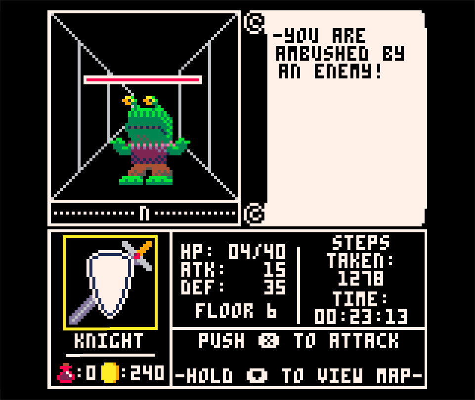
Okay, I'm on the 6th floor and facing death. What is they say in Castle Wolfenstein ?
Aieee !!
...
You have succumbed to your injuries, and fallen in the labyrinth. You will make a fine meal for its inhabitants...
You fell on floor: 6
Total Gold: 240
Sensors detect another quarter in your pocket.

phew that is a hell of a post! i will try to reply to some things..
>> Hey, you've made some changes. I liked the "Q" for mapping, gonna miss it as I sometimes use the BACK arrow to go back a step.
i preferred it that way too, but ran out of buttons. its not an issue on a computer, but realized someone playing with a proper two button controller (or pocketchip) had no way to see the map. compromise for limitations!
>>I also noticed you could hold the DOWN arrow key and still navigate. That would defeat the purpose of the 3D. Suggest if you view map you MUST release it before player can move again so mapping is not something to substitute for visual playing but only to assist for location.
you can play by holding the map button, but youll be at a disadvantage since the first person mode allows you to see 3 blocks ahead for turns/walls, whereas the map gives you no view in front of you if it hasnt been explored yet.
>> Your monsters do not appear to be random encounters but tiles that are fixed from one map to the next. I can't say for certain but I think the original Wizardry had true random encounters. That is, you walk and maybe a critter appears on the next touched tile every 5- or 10% of the time.
i had it this way originally but got hung up with chests/monsters spawning within walls, and changed to the current version when i got frustrated. might take a crack at random (and moving!) enemies in the sequel maybe
>> Made it to the next level. Music is the same ? Since music takes no space away from code, tiles, or mapping, suggest you have a new piece of music each level. Also different music for combat.
i'm completely incapable of making music, this music was provided by this thread
>> You mention you are AMBUSHED by the monster. Ambushed details that the monster strikes first, which shouldn't always be the case. You might have both situations if currently it is only set for player goes first each time:
this phrasing only exists because it fit easily in the scroll lol
>> Unless the player must traverse all the levels backwards to escape, you could determine if the player has in fact nabbed every treasure and event on a level. If this is the case and they are going down a ladder, SEAL the entrance to each ladder going down, so as not to encourage the player to climb back up a ladder to a completely empty level.
the ladders back up are already sealed (they weren't originally, but the automap precluded backtracking since i don't have the spritesheet space to track the explored status of all 8 floors)
>> I still think it would be good if the player got a bonus for each level when all the following is completed.
i like this idea. it would mean readjusting all of the loot tables in the game already though, so it's going in the sequel idea pile. thanks!
>> I see you have the same monster on each level, just colored differently. You might design a new monster for each level using 16x16 pixels (4 8x8 tiles) and then zoom it to the correct scale.
like the music, i have no artistic ability (see: the chests lol). this animated sprite was provided by my good buddy Jonathan Holmes who is a peach. i could have fit more monsters if i didnt have animation frames, but the animation was TOO GOOD to pass up when he sent it to me haha
>> As you are gaining gold, you might have a merchant appear every 2-levels underground. Convert money for potions and other items that might increase Attack and Defense. He can also give you hints and text about what to face in the levels below.
merchants and a full party were both on the original idea block but got chopped as the game bloated. maybe the sequel!
>> I'm not seeing experience points here. Does the player gain levels from arduous combat ?
nope, just golds for leaderboards. stat improvement was part of the original full party plan mentioned above, so also maybe in the sequel?
>> You might make the ladders UP and DOWN to be different colors so the player, upon completing the map doesn't inadvertently track back to the ladder UP thinking it is the DOWN one, that is unless you have random encounters and want the player to risk attacks (10% as listed above) for every step.
the ladder up and ladder down have different sprites on the map (you can tell them apart by the grey line at the top or bottom). but maybe i need to make them more distinct..
>> As for trapped chests. You could have it like a Slot Machine (one reel) where it flips back and forth between trap, gold, bad, bonus. Slowing down to finally pick one, instead of just BOOM, chest was trapped.
i was considering some sort of quicktime event, but i preferred it just being a set chance (thus giving ranger a perk to his char choice)
>> You could also have room traps. They don't always activate but DO appear on the map, forcing the player to go around them as hitting them a 2nd time guarantees their activation - unless you are a THIEF, then you can disarm it.
thats just sadistic lol
>> I'm not seeing any locked gates. Where you can see beyond the room but can't travel there (3 horizontal lines barring your path). With a KEY, however, you can pass. And these can be purchased by merchants and sometimes found if you want your map to have it.
thats a fun idea! added to sequel pile!
>> As the lower levels are having more critters, you might have an ANGEL STATUE or something that heals all your hits, but only once, and you have to AGREE to be healed so if you choose not to, you can save it for later. Unlike potions the STATUE heals ALL your hits no matter where they are at.
i like just having potions, since it allows the cleric to have a perk. but with a theoretical full party in the future, maaaaybe something like this?
>> Cosmetic, you may change the wall colors every 3-levels underground to give the player a feeling of depth that they have traveled.
thats not a bad idea, at the very least making them go from lighter to darker as you go deeper. originally i was also drawing 'brick lines' on the walls but it just looked way too busy at such a low resolution
>> You fell on floor: 6
Total Gold: 240
not bad! i'm actually curious if anyone's ever beaten it with all the classes, i think this is the most dedicated feedback i've gotten so far haha

>>i think this is the most dedicated feedback i've gotten so far haha
I'm always interested in RPGs and have a pretty broad knowledge of the mechanics in them having written one complete RPG Maker and a dozen other incomplete ones for different platforms and consoles.
Racers, shooters, fighters, battlers, and platformers - not so much.
>>phew that is a hell of a post! i will try to reply to some things..
>>i preferred it that way too, but ran out of buttons. its not an issue on a computer, but realized someone playing with a proper two button controller (or pocketchip) had no way to see the map. compromise for limitations!
I'm curious then. Does PICA use 2-buttons or 3 ? What is button Q ?
>>you can play by holding the map button, but youll be at a disadvantage since the first person mode allows you to see 3 blocks ahead for turns/walls, whereas the map gives you no view in front of you if it hasnt been explored yet.
Yes but the player can still hold it down and quickly navigate to the exit. You try reading a map while you're driving and you'll find the front end of a tree. :)
Just something to think about, lock the arrows when viewing the map. In fact, you could set it so you don't hold down "Q" just tap it once. You could animate the player's position to by flashing it.
i had it this way originally but got hung up with chests/monsters spawning within walls, and changed to the current version when i got frustrated. might take a crack at random (and moving!) enemies in the sequel maybe
Well, moving monsters REALLY would be a pain unless you plan to show them at a smaller scale down the hallway. Random encounter might just be the way to go.
>>i'm completely incapable of making music, this music was provided by this thread
It shouldn't be too difficult. You may send a shout-out in here for anyone who wants to provide you with music.
>>this phrasing only exists because it fit easily in the scroll lol
I've written two books, one autobiographical, the other a science fiction story of 4 books total, I use this website to help me with words if you are wanting to have them appear a particular way and to be a specific size.
http://www.thesaurus.com/browse/encounter?s=t
>>the ladders back up are already sealed (they weren't originally, but the automap precluded backtracking since i don't have the spritesheet space to track the explored status of all 8 floors)
I know they did this on Apventure to Atlantis (spelled correctly). You would explore a temple, tomb, or crypt and when you leave it said, "The entrance sealed behind you as you left."
They also do this for Berzerk.
https://atariage.com/2600/screenshots/s_Berzerk_2.png
>>i like this idea. it would mean readjusting all of the loot tables in the game already though, so it's going in the sequel idea pile. thanks!
Awright, one got in there anyways ! :)
>>like the music, i have no artistic ability (see: the chests lol). this animated sprite was provided by my good buddy Jonathan Holmes who is a peach. i could have fit more monsters if i didnt have animation frames, but the animation was TOO GOOD to pass up when he sent it to me haha
If you don't mind the source, I was working on a Gameboy Advance RPG Maker and used the B&W sprites from Final Fantasy Adventure from the first Gameboy as the default selection of 16-monsters you could find in a random encounter.
Then I colored them using my own custom 16-color palette. You are welcome to use and convert them.

To animate these, merely plot them with X reversed.
>>merchants and a full party were both on the original idea block but got chopped as the game bloated. maybe the sequel!
Looking forward to seeing it !
>>ope, just golds for leaderboards. stat improvement was part of the original full party plan mentioned above, so also maybe in the sequel?
Any little bit will help. Perhaps add a Max HP every level and a Strength every 2-levels.
>>the ladder up and ladder down have different sprites on the map (you can tell them apart by the grey line at the top or bottom). but maybe i need to make them more distinct..
Wow, I missed that. Must be super tiny. :)
i was considering some sort of quicktime event, but i preferred it just being a set chance (thus giving ranger a perk to his char choice)
If that's the case you could add:
Chest is trapped. Let's see if you manage to avoid it (sinister and slow 5 dots), then show outcome.
>>thats just sadistic lol
One of the first RPGs I wrote for Commodore Amiga, Dragonhunt, used completely invisible traps. They were:
[1] Wind. Blows out torch but not magic light.
[2] Warp. At the time they warped you to a random location. Today I know this is not good and should only warp to a SPECIFIC location.
[3] Poison. Player is poisoned and loses HP with every step.
[4] Spikes. Player is injured.
thats a fun idea! added to sequel pile!
Nice ! Will be cool to see that.
>>i like just having potions, since it allows the cleric to have a perk. but with a theoretical full party in the future, maaaaybe something like this?
This will definitely be of benefit to a party of 4. In my RPG Maker, if you touch the angel tile, she heals all hits every time. At one point in making a sample game I designed my own 'angel' and had her give out after 3-uses along with an apology and phone number to call for maintenance. :)
>>thats not a bad idea, at the very least making them go from lighter to darker as you go deeper. originally i was also drawing 'brick lines' on the walls but it just looked way too busy at such a low resolution
You mentioned lighter to darker. Is there a way to change the original 16-color paletter of PICO ?
>>not bad! i'm actually curious if anyone's ever beaten it with all the classes,
Not now but later I wanted to try and tackle it with the wizard. Seeing if that will help me as I go to deeper levels.
Hope This Helps !

>> I'm curious then. Does PICA use 2-buttons or 3 ? What is button Q ?
yep just up/down/left/right and z/x. q is the 'x' on the second player controller. theres a good rundown of the input (and other stuff) at https://neko250.github.io/pico8-api/
>> Wind. Blows out torch but not magic light.
agh from the BEGINNING i wanted torches/darkness in this game so bad since its integral to the old Wizardy/Ultima games. just had to cut for lack of buttons (unless i wanted every action to be on a menu which was super un-fun when i messed with it)
>> You mentioned lighter to darker. Is there a way to change the original 16-color paletter of PICO ?
nope, those 15 colors + transparency bit are all you get (the palette is listed on that link above as well).
some people have messed with using the 60fps mode to quickly flash two colors alternating to create a 'blend' effect, but compatibility is still spotty with that technique (doesnt work in web player, for instance)
[Please log in to post a comment]


